CSS3 线性渐变(linear-gradient)
 ####linear-gradient语法
linear-gradient( [ <angle> | to <side-or-corner> ,]? <color-stop> [, <color-stop>]+ )<angle>|to <side-or-corner>表示线性渐变的方向。默认从上到下渐变。
<color-stop>表示渐变的颜色范围。
####实例
#####实例1
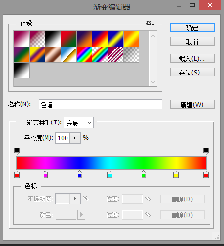 通过photoshop作图软件可以很容易的制作渐变。那么如何将渐变转换为CSS代码呢?首先打开photoshop的渐变编辑器,查看渐变的详细参数。参考photoshop渐变。
根据上图的透明度色标和色标的具体数值转化为CSS代码。
第一个色标的颜色为rgb(255,0,0),位置为0%,对应的CSS代码为rgb(255,0,0) 0%。
第二个色标的颜色为rgb(255,0,255),位置为15%,对应的CSS代码为rgb(255,0,255) 15%。
其他色标以此类推……
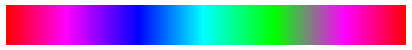
详细代码如下:
<div class="color-atlas"><div>
.color-atlas {
	width: 400px;
	height: 40px;

	background: linear-gradient(
		to right,
		rgb(255,0,0) 0%,
		rgb(255,0,255) 15%,
		rgb(0,0,255) 33%,
		rgb(0,255,255) 49%,
		rgb(0,255,0) 67%,
		rgb(255,0,255) 84%,
		rgb(255,0,0) 100%
	);
}
效果图
####实例2
云朵效果